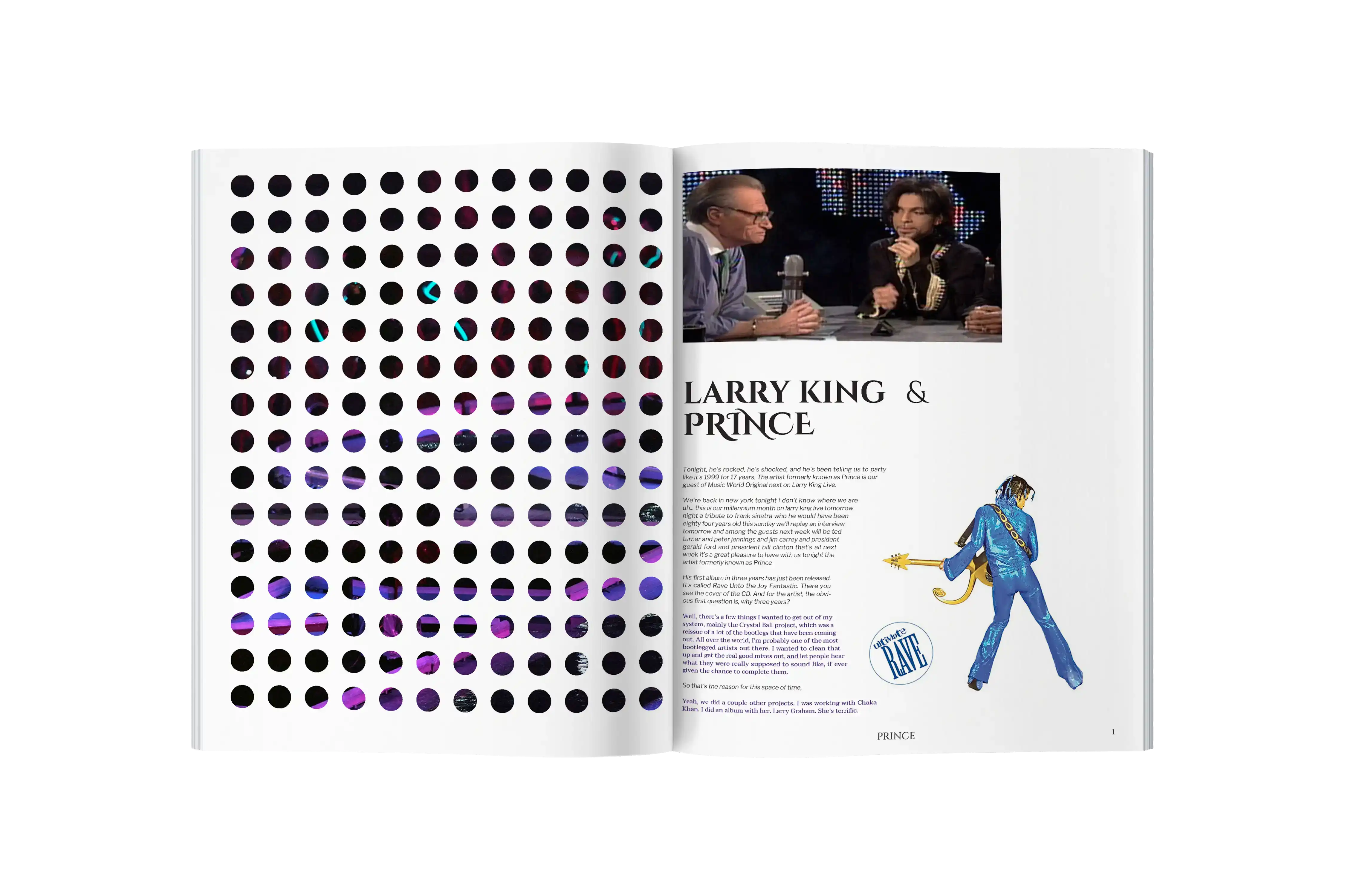
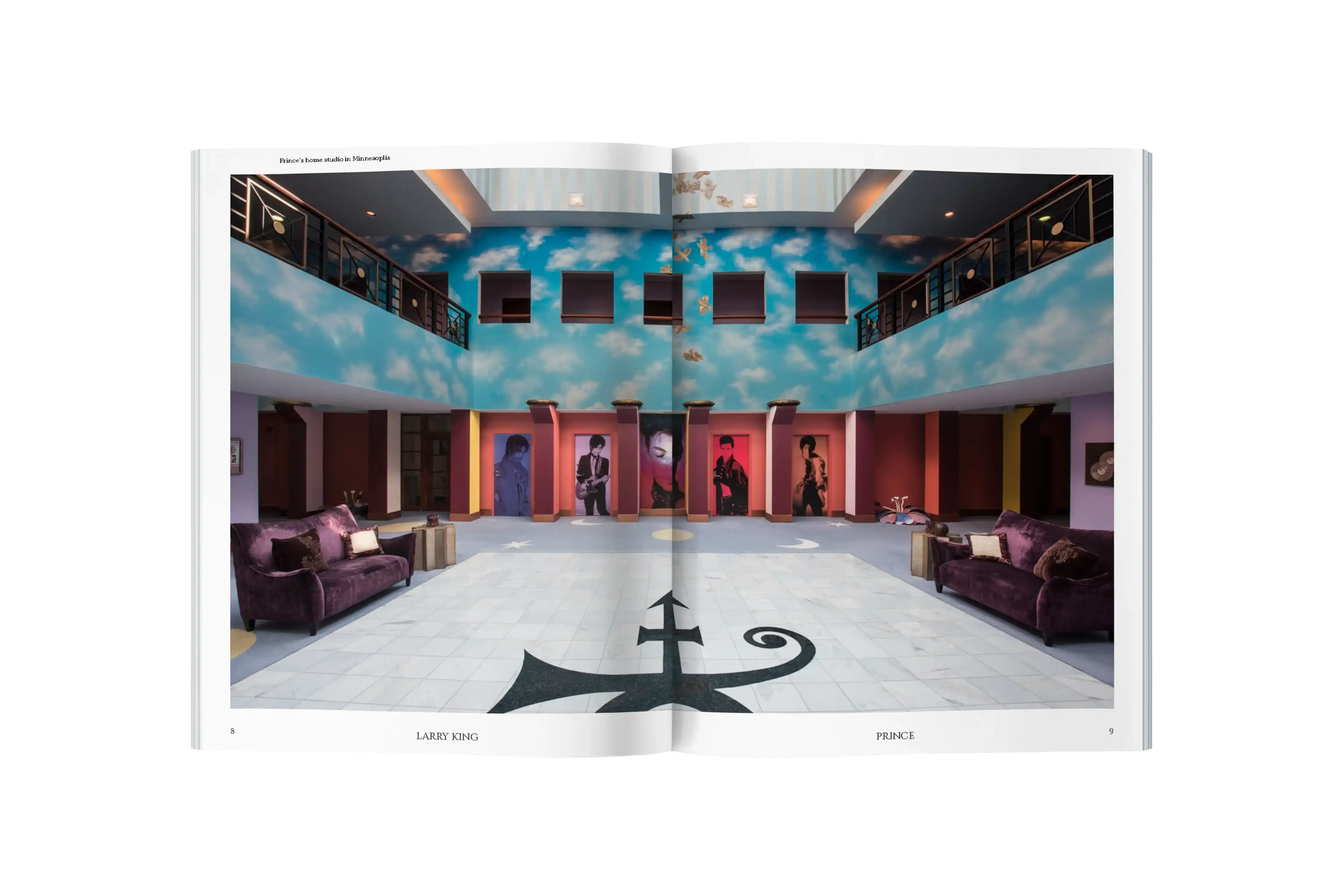
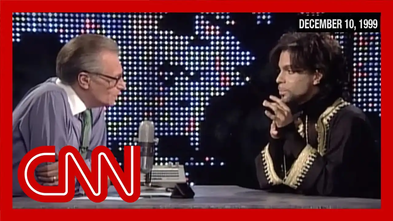
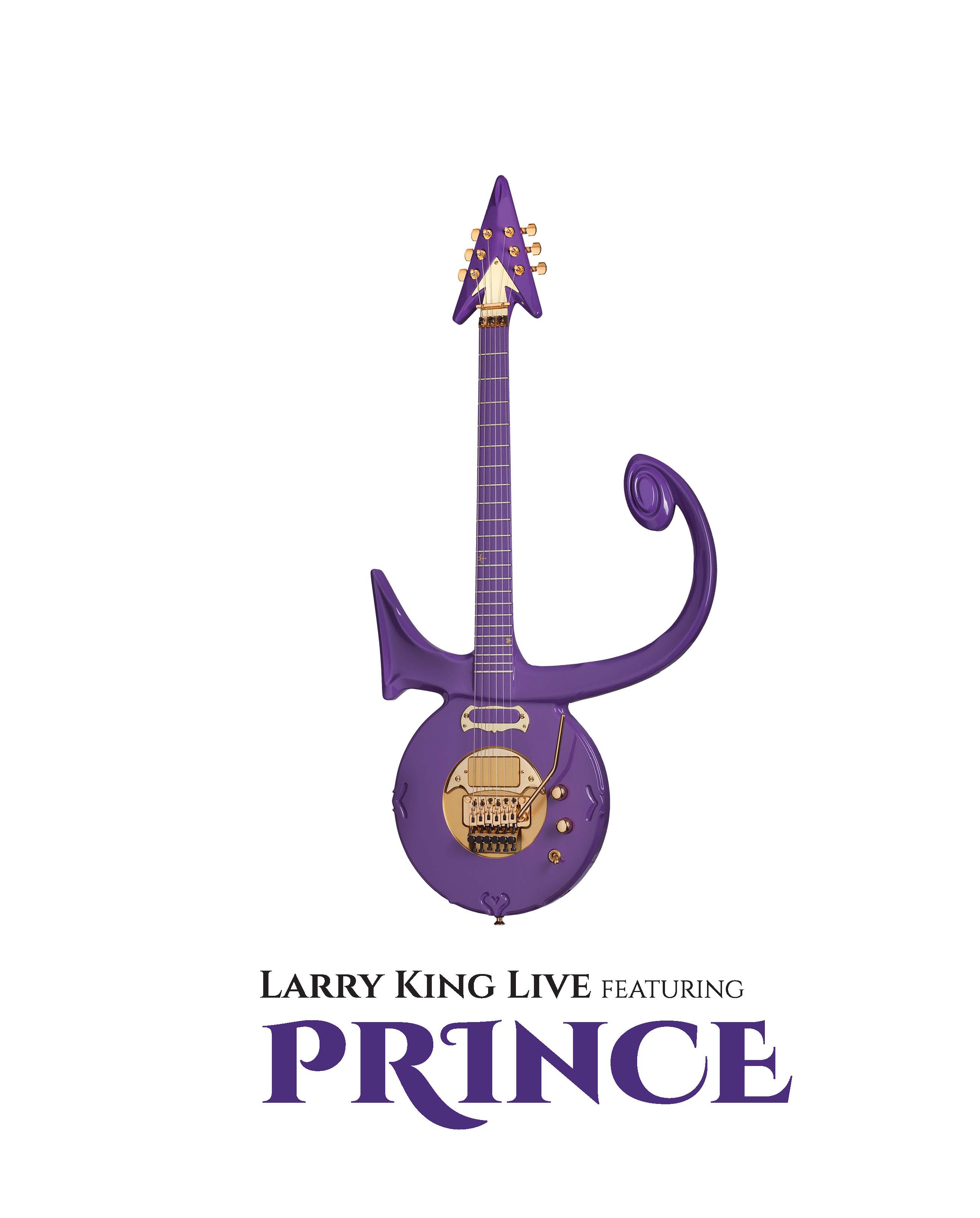
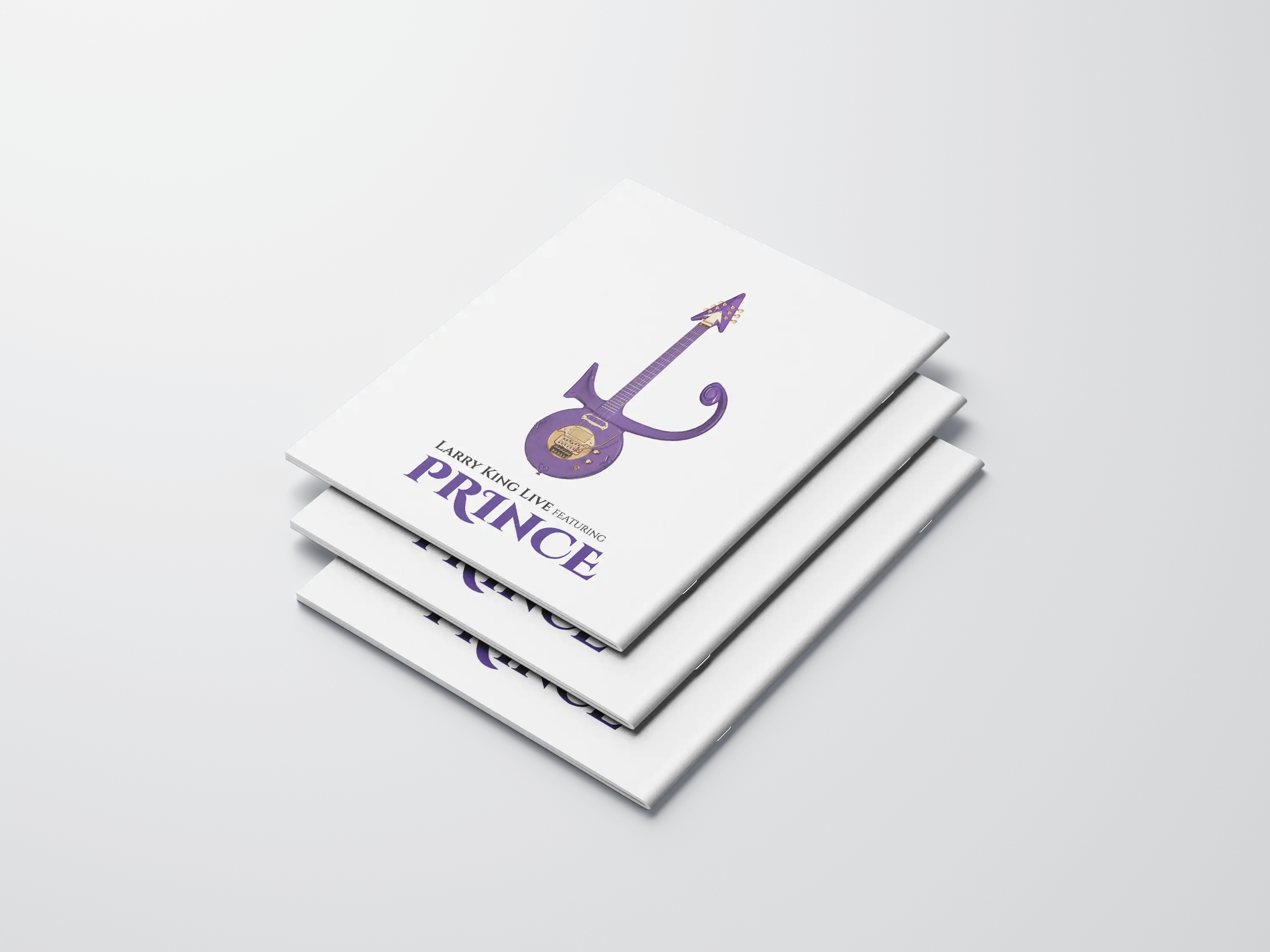
Prince on Larry King Live
Project Type
Publication Design
Editorial
Programs Used
Indesign
Photoshop
Illustrator
Overview
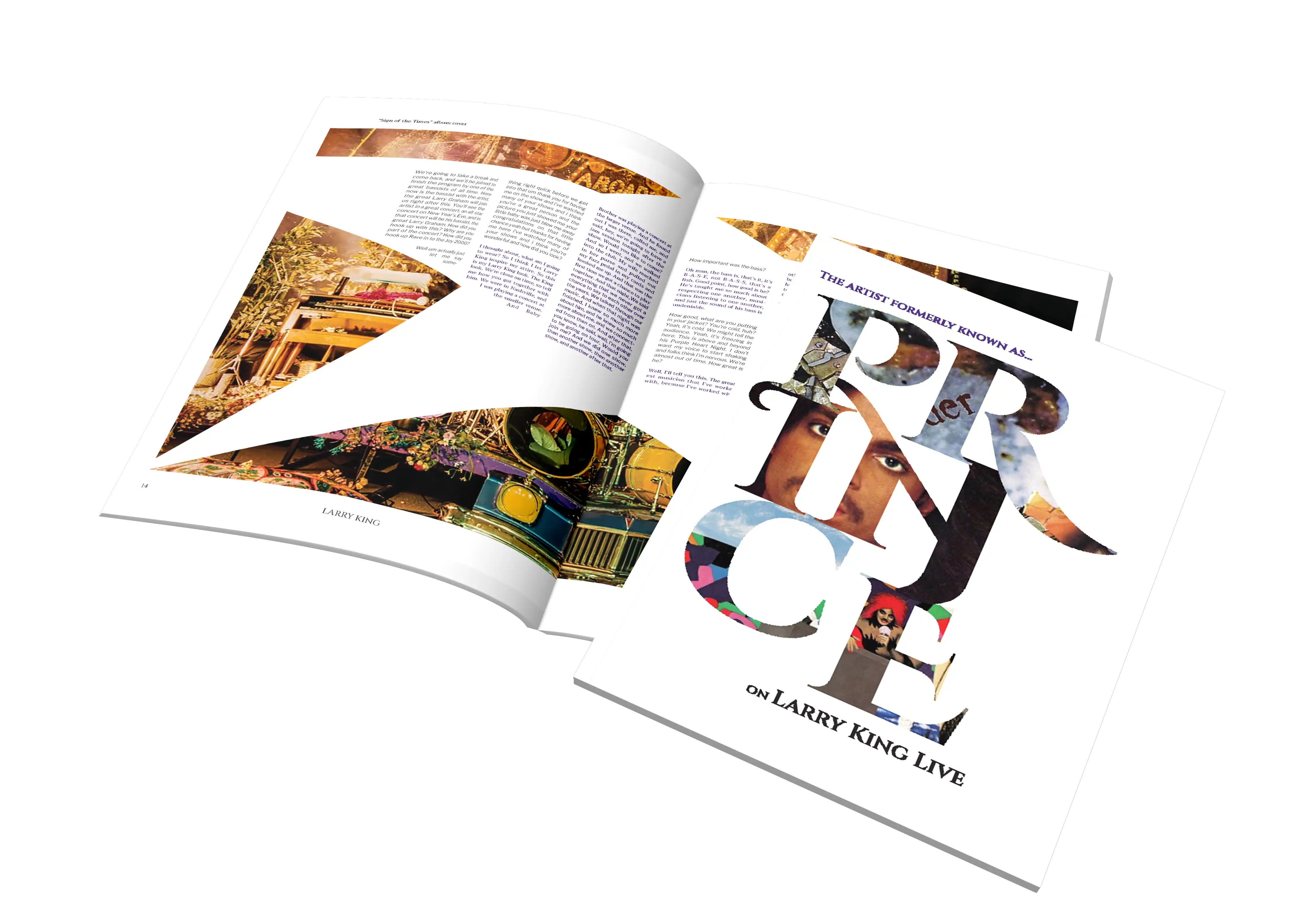
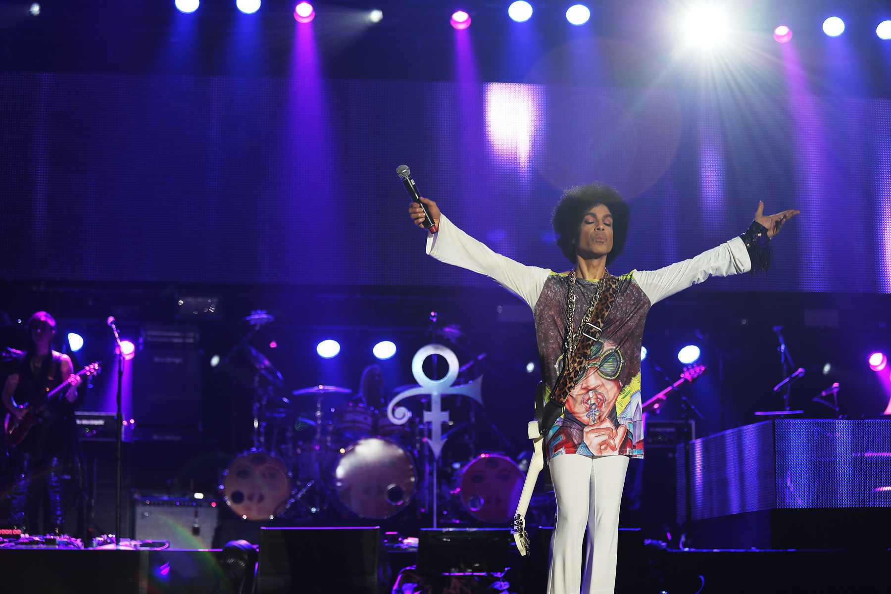
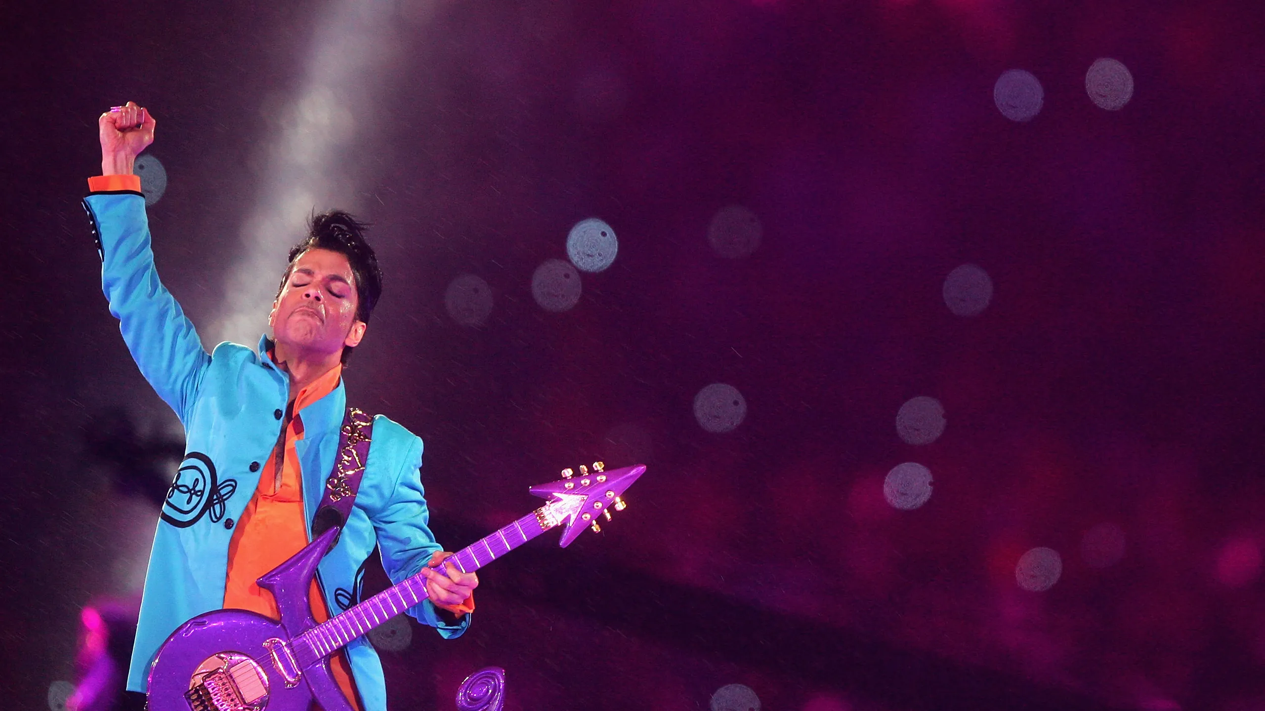
Editorial design for the interview between Larry King and Prince Rogers Nelson, who'd recently changed his name to "The Artist Formerly Known as Prince".
Prince's personality is brought to life through type and image. Framing of photos and creative manipulation of text columns were how Prince's power over the written word and individualism stand out among more conventional editorial designs.
Process
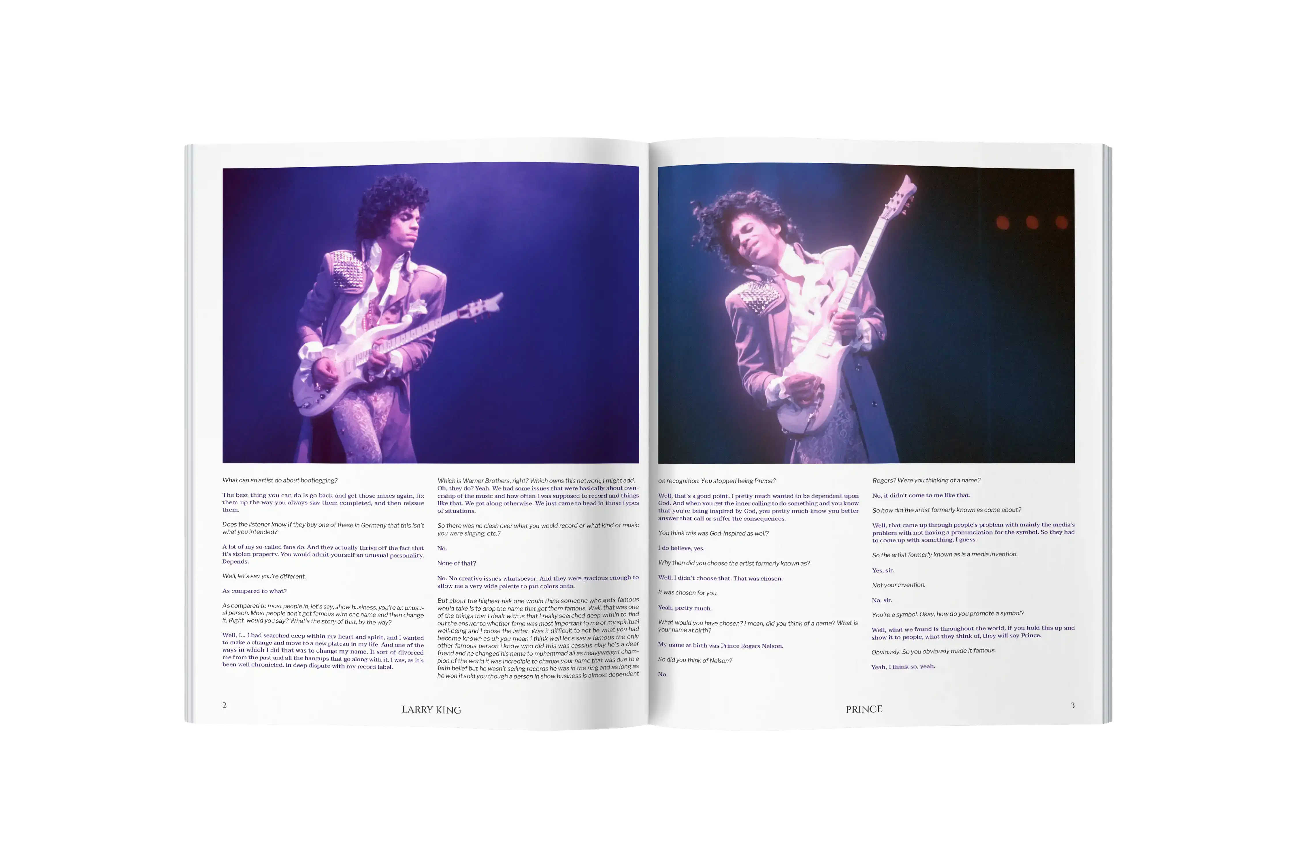
Balancing Opposites
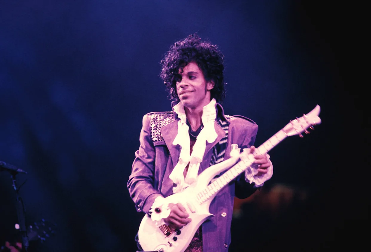
Designing an editorial that felt expressive required embodying Prince's refusal to fit into a box of what people expected him to be. He was well known for his challenging of ideas of masculinity, fame, and showmanship.
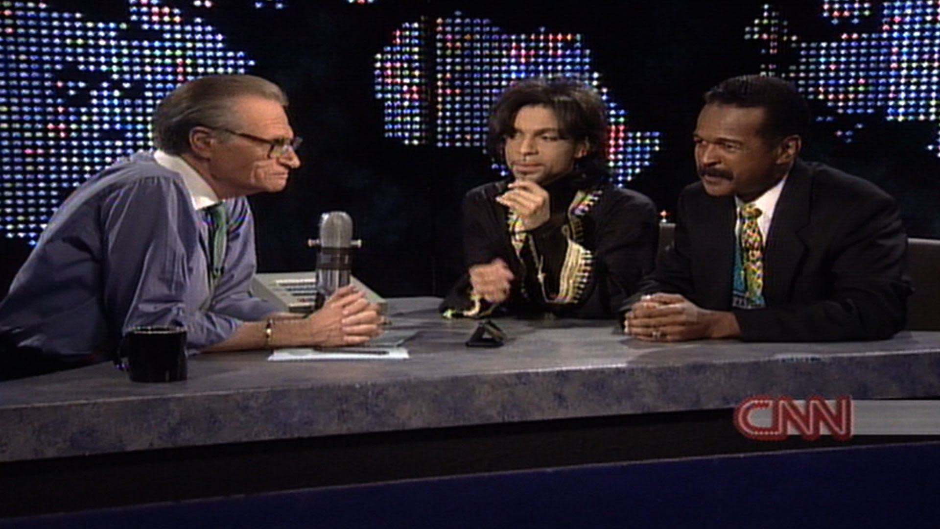
Larry King on the other hand, is somewhat opposite to Prince, even when Prince's style choices here feel more subdued, the differences between them stand out.
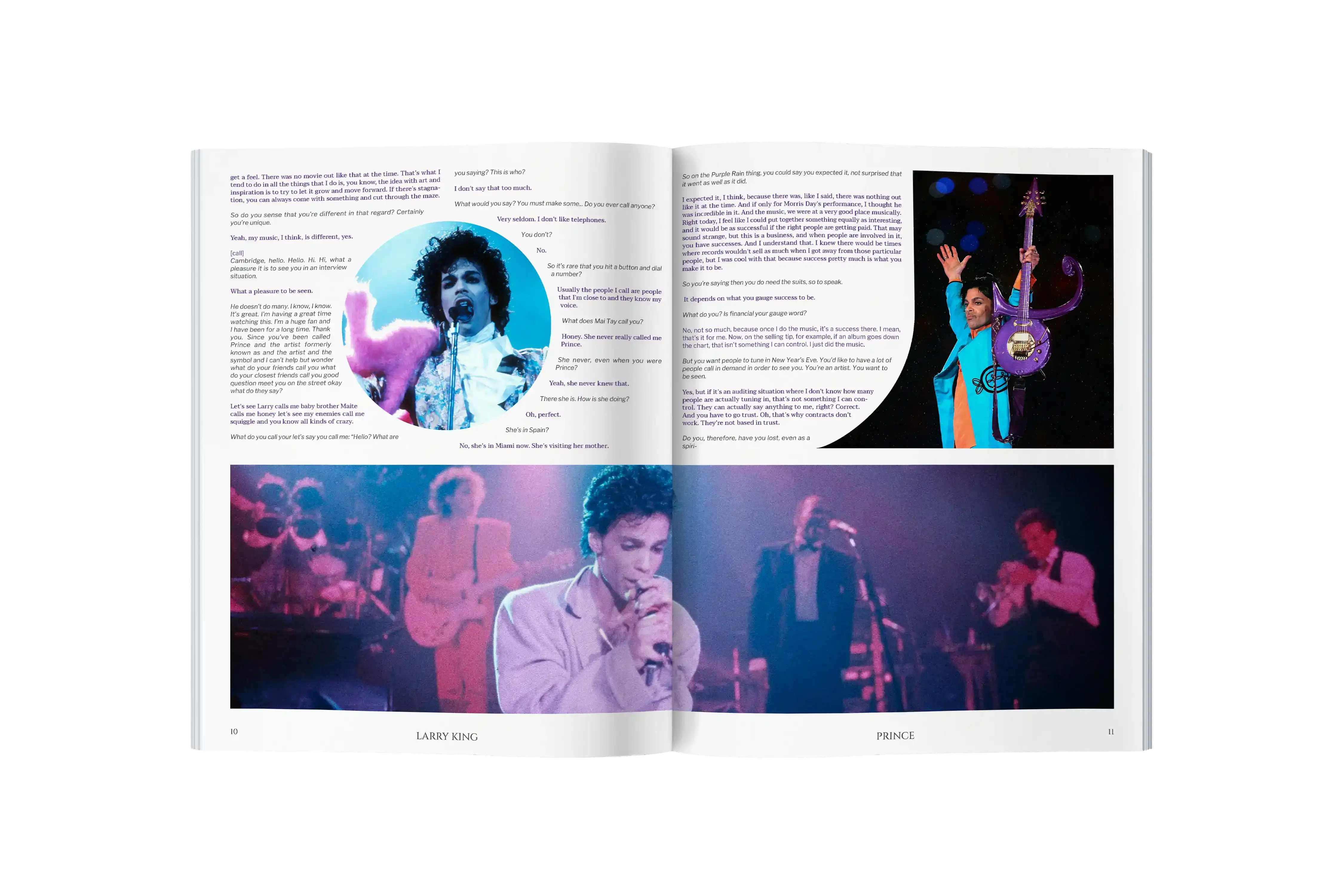
Typography
Prince and Larry were represented by contrasting typefaces that created a stylistic dialogue.
Larry was Arial, a sans serif typeface that is well designed, medium contrast, and performed the job effectively. Everything about him in the interview feels conventional and precise, just like the Arial typeface.
Prince was Garamond, timelessly elegant, well respected, and contrasts well with Larry's Arial sans serif. Definitely fits our need for type that feels close to Prince's personality but also tolerable for reading large bodies of text.
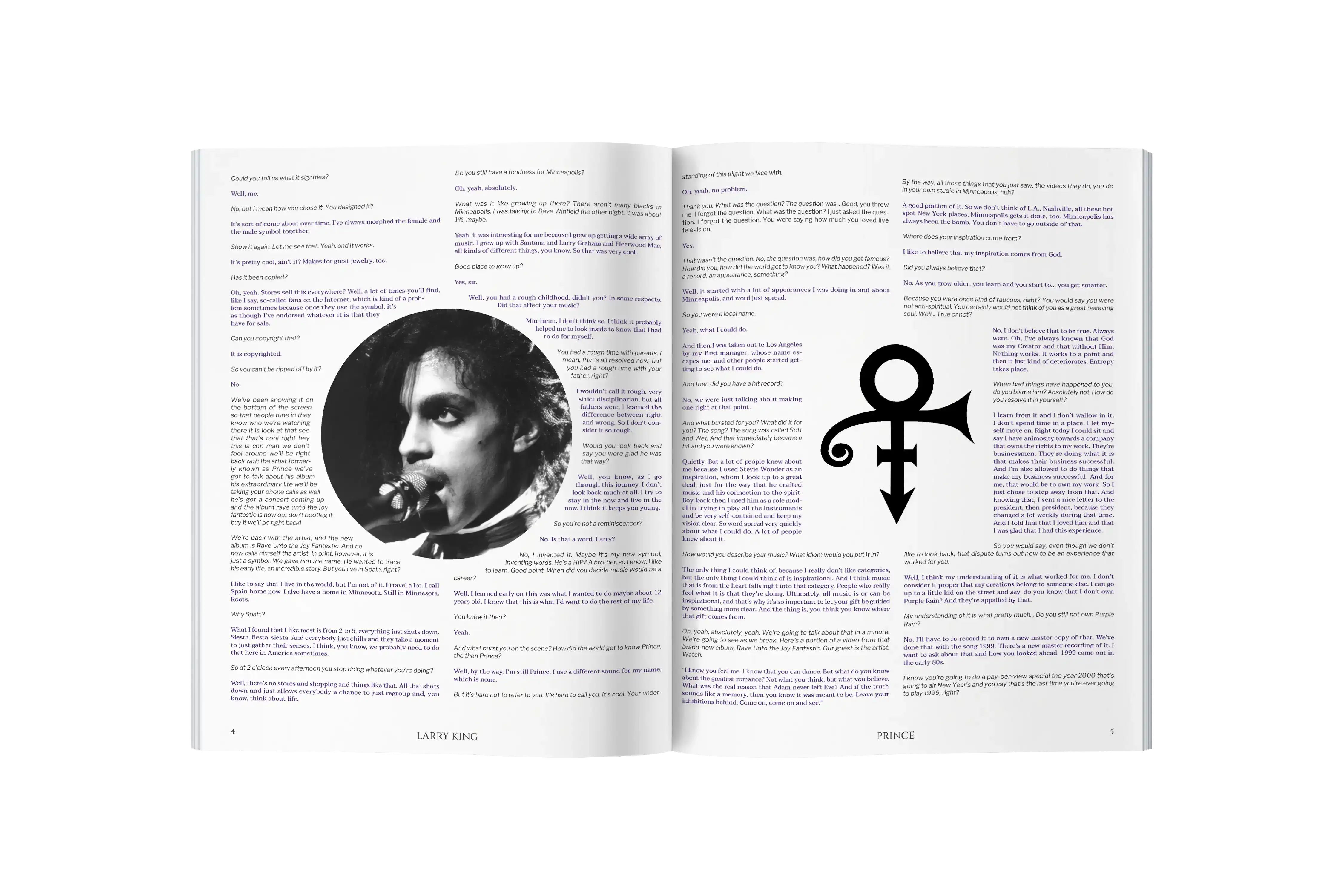
Type as Image
Cinzel Decorative is the intersection of type and image for the editorial. The expressive swashes and flourishes of the letters evoke the dynamism of Prince's live performances and his unique fashion silhouette.
Color
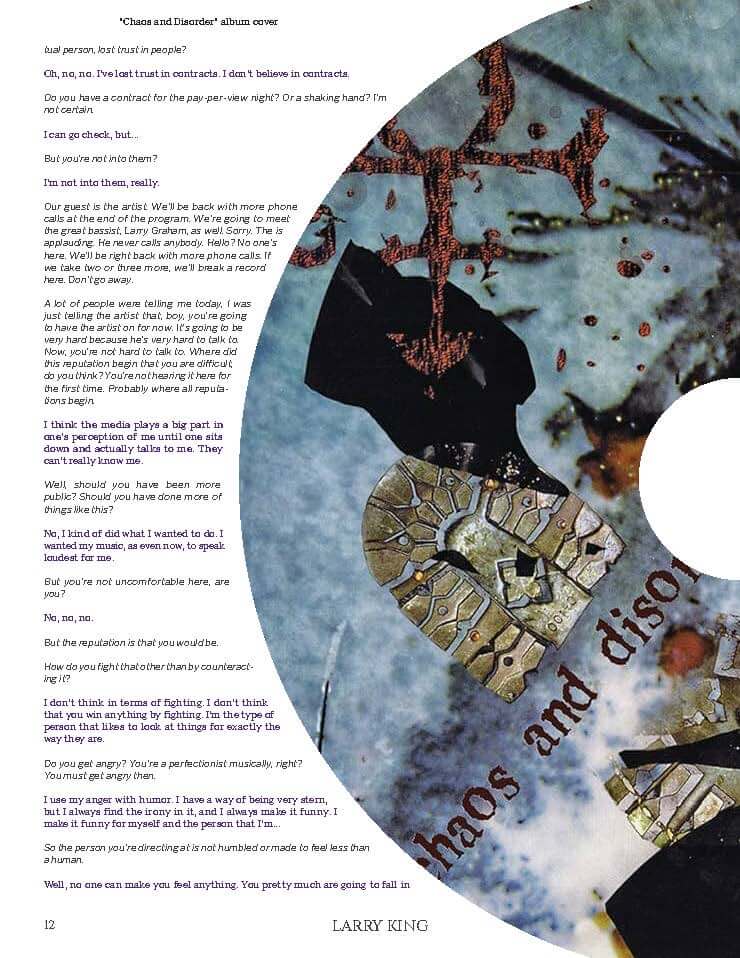
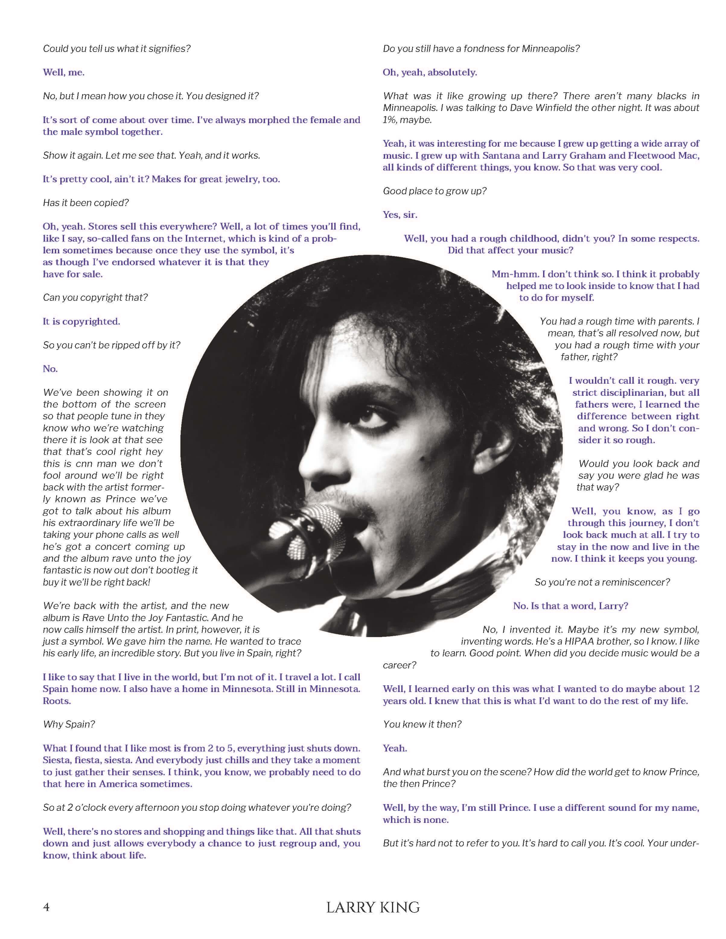
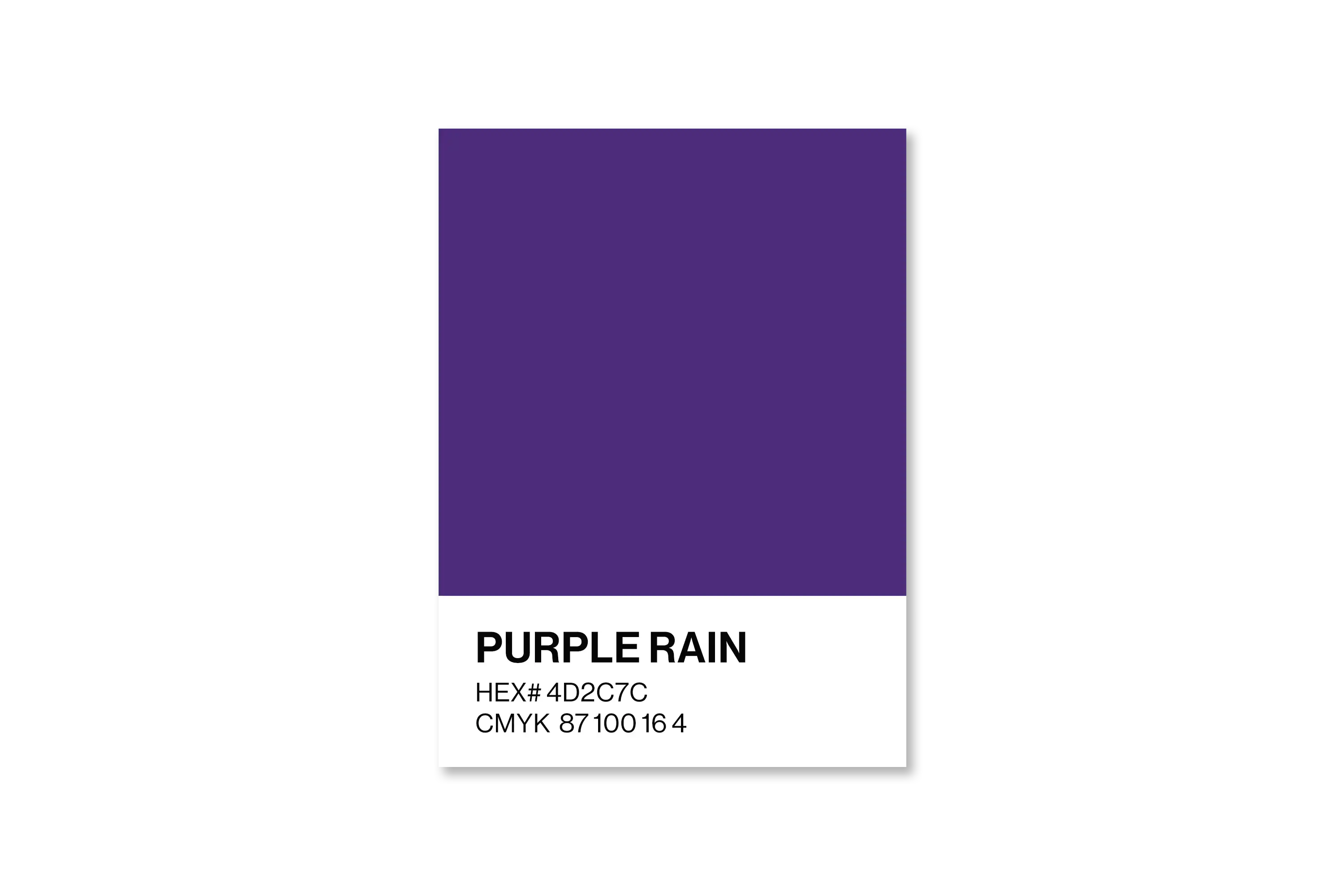
Prince's Purple Rain film and album by the same name gave him a special connection with his distinct purple shade. Difficult to mix but necessary for the message of the design.
Prince's spoken word is colorful to stand out against Larry's black text. My "Purple Rain" mixture was successful in being vibrant enough to provide emphasis while still being readable.
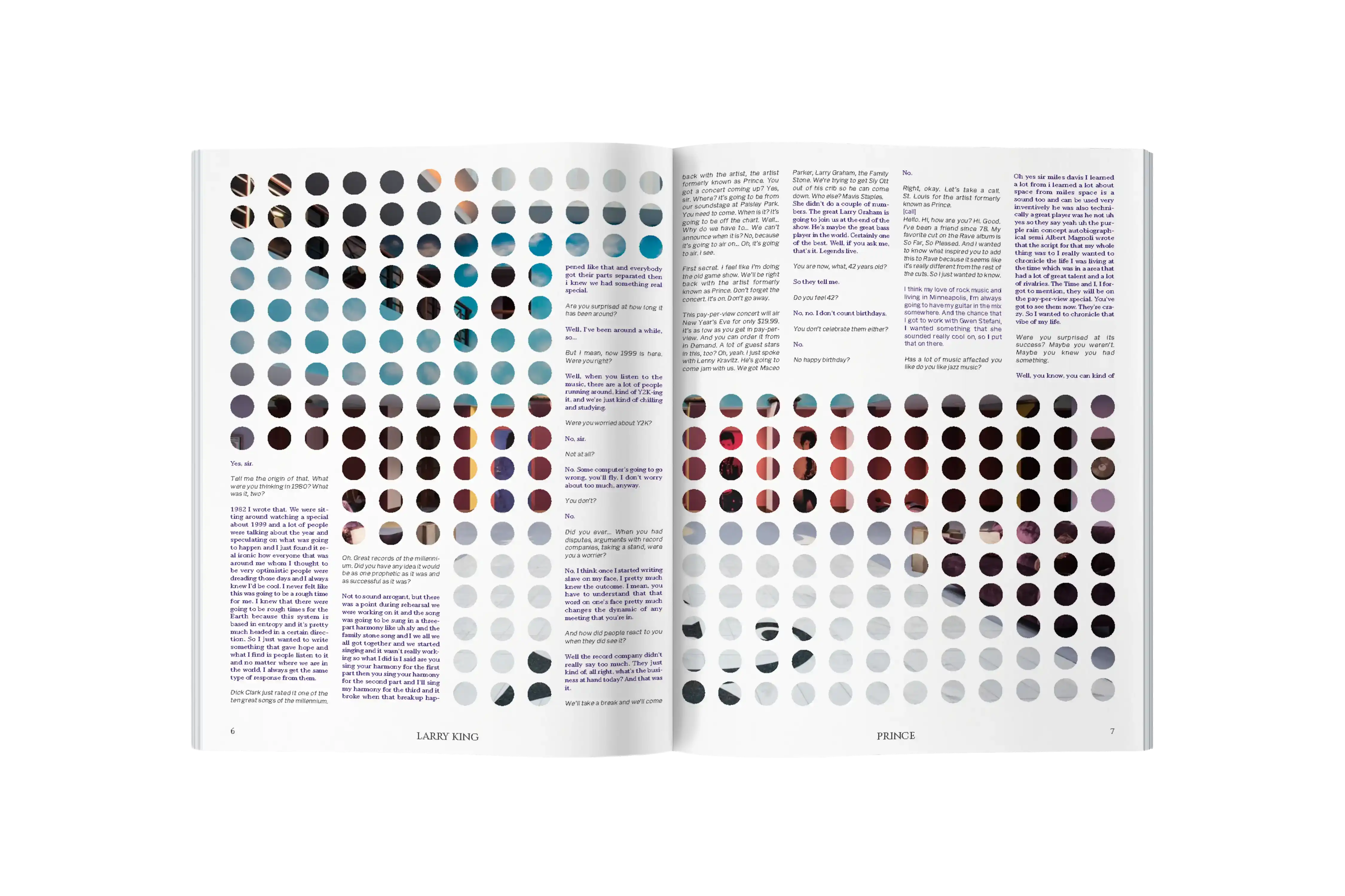
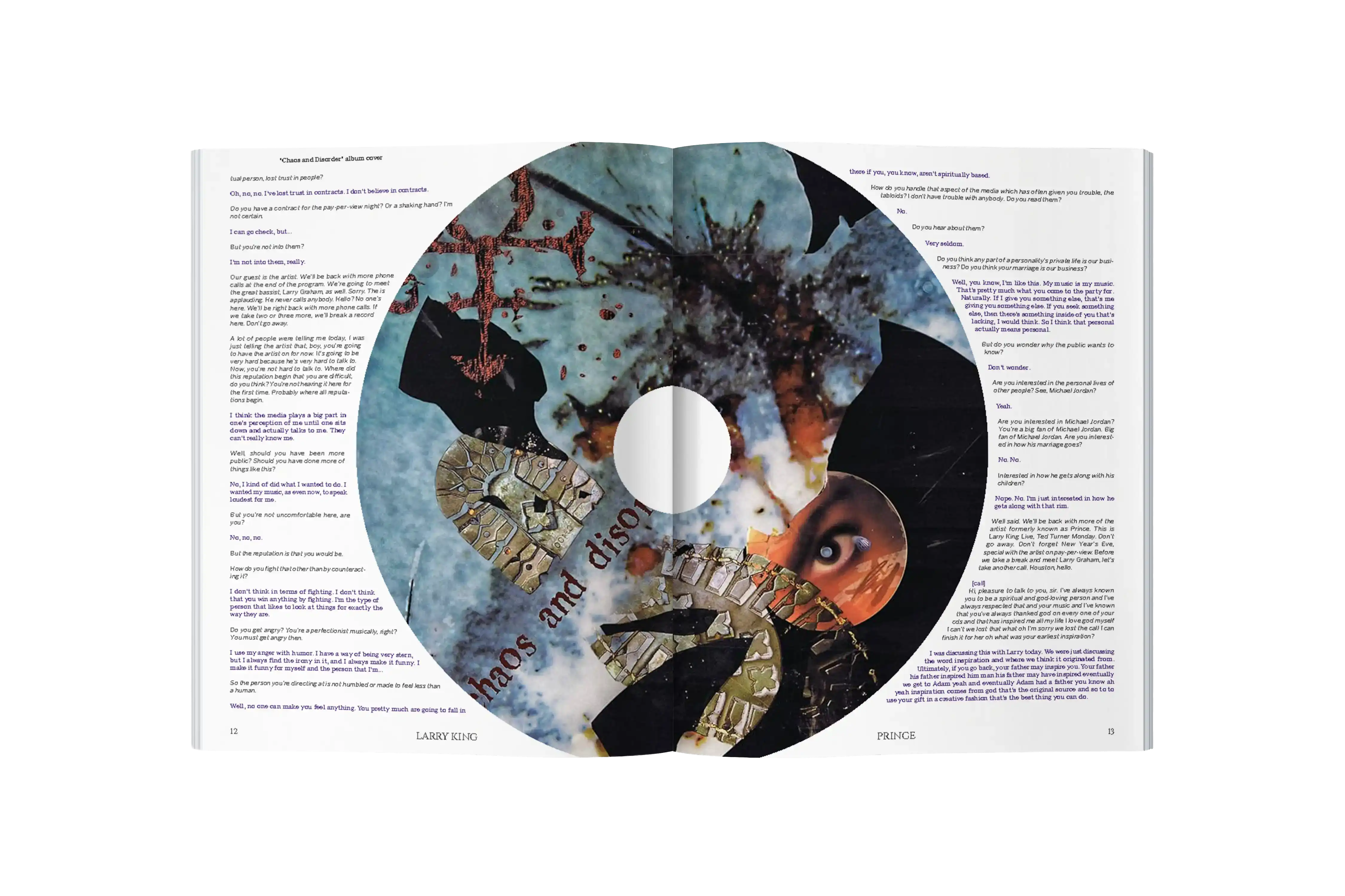
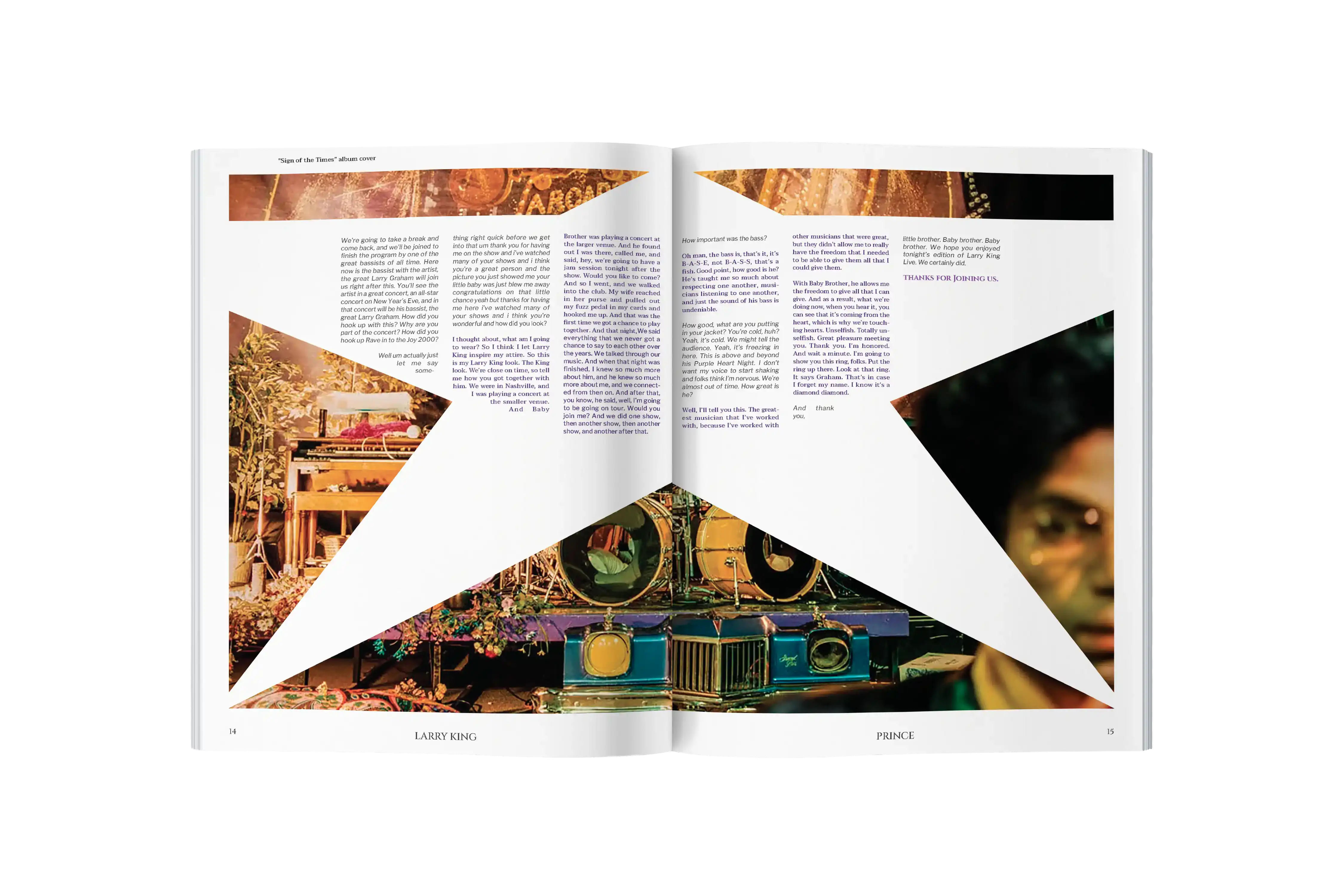
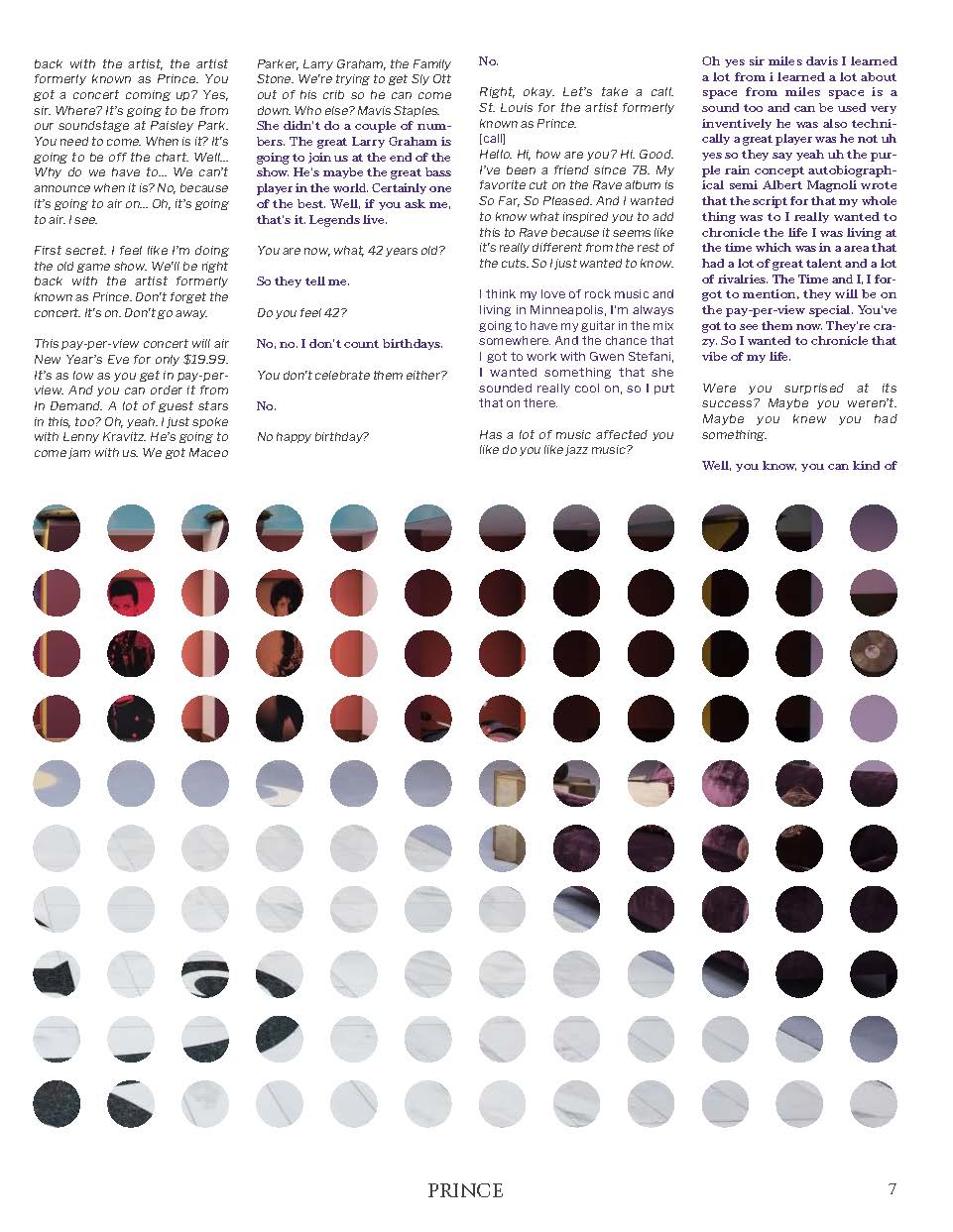
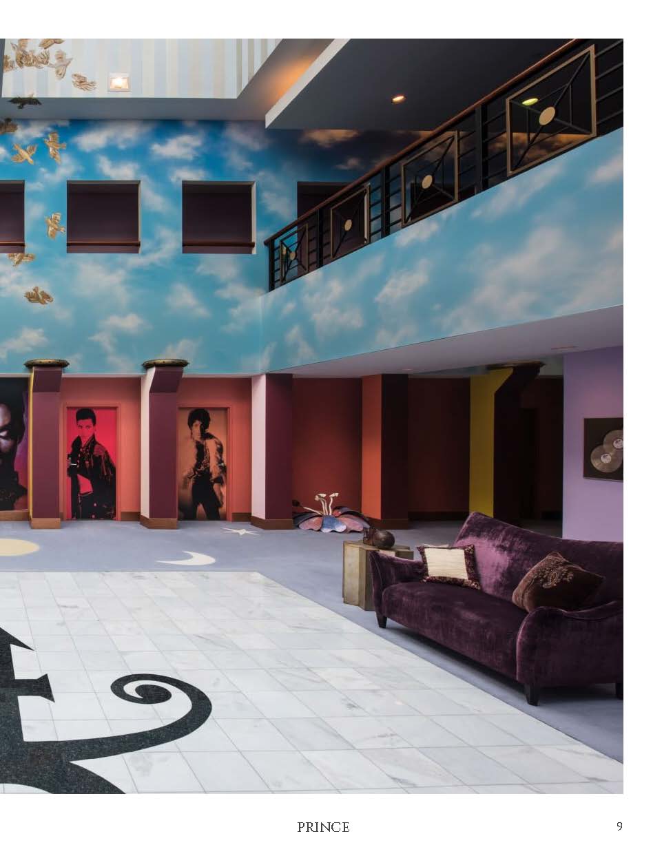
Framing Images
Prince's enigmatic nature brought an underlying theme of secrecy to the editorial. Prince is a public figure but values his personal development and privacy more than his fame.
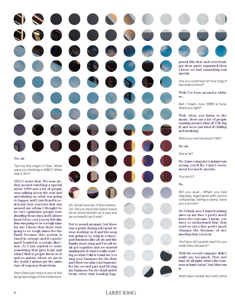
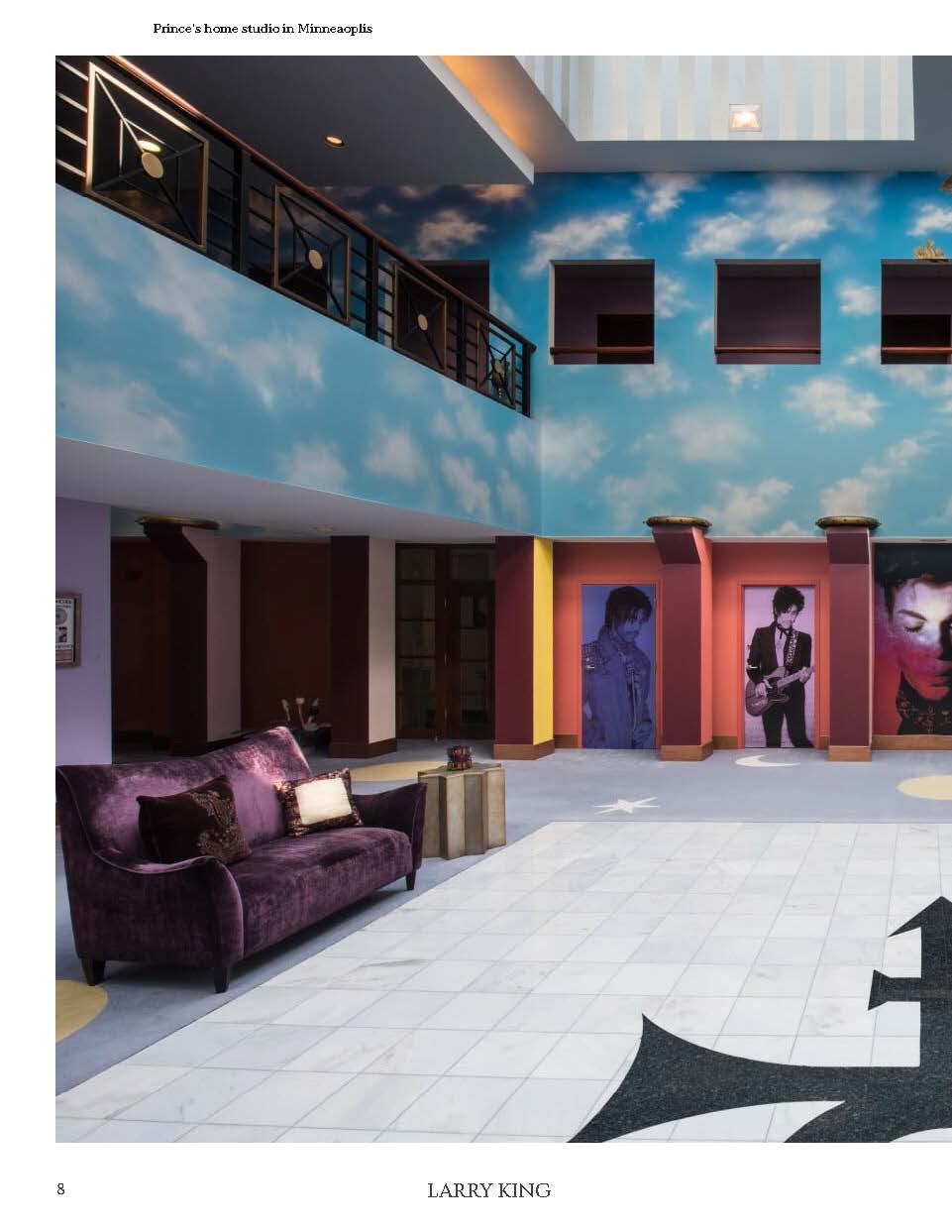
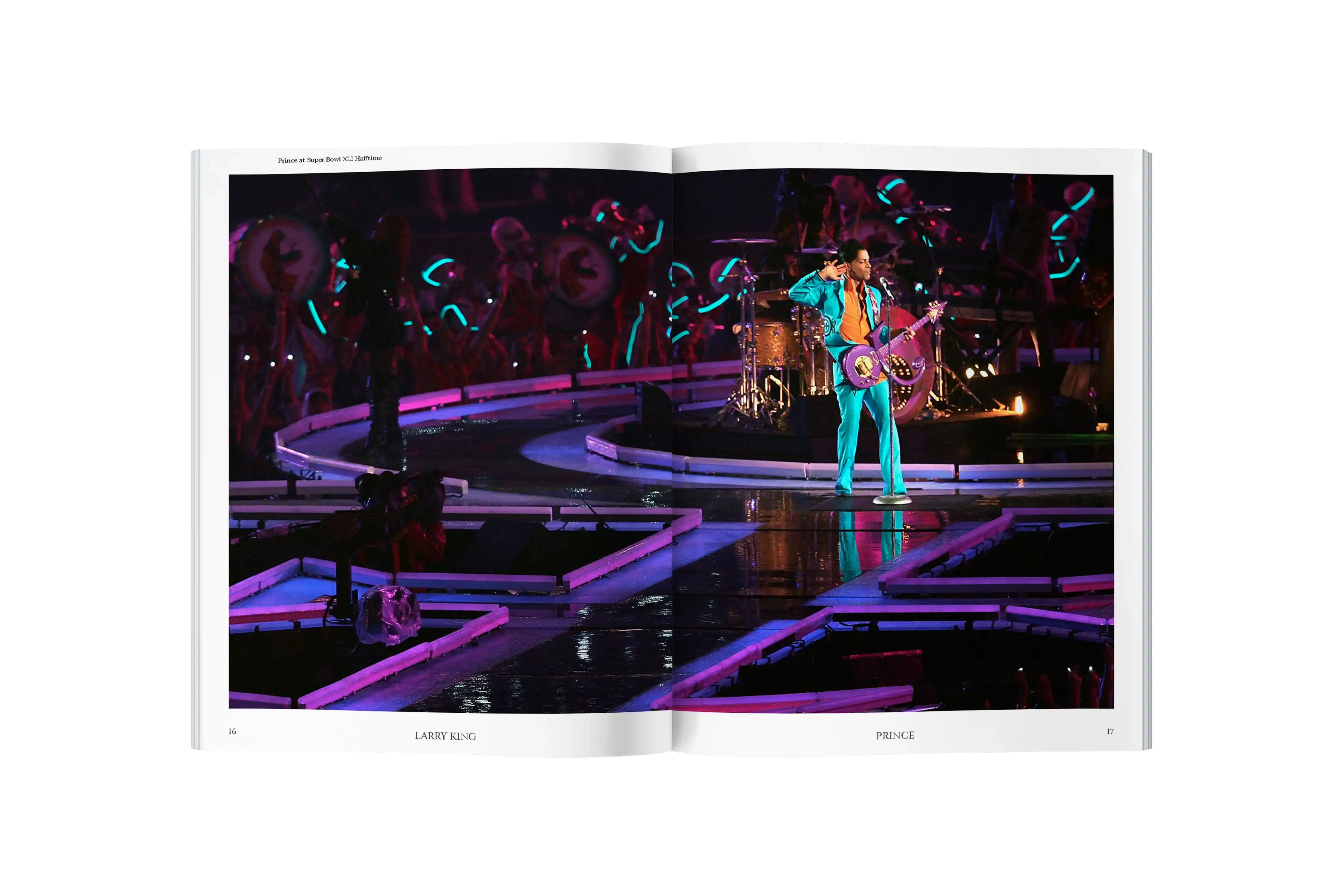
Images in the editorial are where reader behavior is tested. Readers are forced to grapple with how much they want to see the hidden image while reading the interview. This tension is resolved by a full spread reveal, creating rhythm similar to something you would find in Prince's music catalog.
Final Design
Prince and Larry King are both well spoken individuals whose mix of talents made this interview entertaining to watch.
The editorial's success was in visualizing the flow of conversation being had by two people with different careers and upbringings but still ended up in the same place and time.